Mastering Zoho CRM Canvas: Best Practices for Customization
Zoho CRM Canvas is a no-code design studio that empowers you to break free from pre-defined layouts and customize the look and feel of your Zoho CRM interface to match your specific needs. Keep on reading this blog post to learn the best practices for Zoho CRM Canvas customization.


Customer relationship management (CRM) software is growing by leaps and bounds, but a little known secret is that most salespeople struggle to use them effectively. People complain all the time about clunky interfaces, irrelevant information overload, and a one-size-fits-all approach that doesn't fit their needs.
If you've been finding Zoho CRM's interface a bit overwhelming, you're not alone. The struggle is real: As we all know, Zoho CRM can do amazing things, but wading through endless data fields and clunky interfaces makes it difficult to find the information your sales team needs. This makes your sales team's job more challenging than it needs to be.
This is Where Zoho CRM Canvas Shines! Canvas is a no-code design studio, where users can customize their Zoho CRM interface to match their sales process perfectly, industry, and business needs. No coding required, just drag-and-drop simplicity. Forget one-size-fits-all interfaces!
Intrigued? Let's delve into this blog post to know about what is Zoho CRM Canvas, the benefits of using Canvas in Zoho CRM, how does Zoho CRM Canvas differ from Standard Zoho CRM Interface, common mistakes to avoid when using Canvas in Zoho CRM, and the best practices for Canvas Layout Customization.
Without any further ado, let's dive in.
What is Zoho CRM Canvas?
Canvas is a no-code design studio built right into the Zoho CRM platform that empowers users to customize the Zoho CRM interface using Canvas Builder (drag-and-drop interface). This means you can ditch the pre-defined layouts and tailor your Zoho CRM to match your specific sales process perfectly and team needs, ensuring your Zoho CRM looks and works exactly the way you need.
Picture this: a cluttered desk with papers everywhere versus a clean, organized workspace with everything you need at your fingertips. Which one do you prefer? The same goes for your CRM. Canvas empowers you to create a personalized view of your CRM data, tailoring it to your specific needs and preferences, which boosts user adoption.
Why Zoho Users Should Consider Canvas?
It's important to understand that Zoho CRM remains perfectly functional without Canvas. Using a no-code design studio like Canvas allows users to have complete control over the design and layout of their CRM interface without coding knowledge. This allows businesses to quickly and easily customize the CRM interface to fit their exact needs.
The following advantages can significantly enhance your team's CRM experience with Canvas:
- Enhanced User Experience: With Zoho CRM Canvas, users can drag and drop various elements such as fields, buttons, and modules onto the interface. They can arrange and organize these elements according to their preferences to create a personalized layout.
With Canvas, teams can prioritize the information most relevant to their daily tasks. This means you can prioritize the data that matters most, hide irrelevant fields, and arrange everything in a way to create an intuitive user experience. This makes it easier for teams to quickly access the information they need to make informed decisions.
For instance, a sales team might prioritize pipeline visibility, while a customer support team might focus on open tickets. This targeted approach allows users to find the information they need quickly and efficiently, boosting productivity. - Improved User Adoption: By ditching the one-size-fits-all interface, Canvas empowers users to personalize the layout, prioritize the data they use most, and hide unnecessary fields. This level of customization not only improves user satisfaction but also enhances productivity, as users can access the information they need more efficiently. Moreover, Canvas enhances the user experience and encourages users to interact with Zoho CRM more often.
Overall, Canvas has played a crucial role in driving user adoption of Zoho CRM. - Industry-Specific Customization: Industry-specific customization in Zoho CRM using Canvas allows businesses to tailor CRM interfaces to meet industry-specific needs.
For example, a real estate company can design a visually rich interface to display property listings, client interactions, and sales pipelines in a way that is intuitive for agents. Healthcare providers can customize their CRM to track patient information, appointment schedules, and medical histories, ensuring seamless access to critical data.
By leveraging drag-and-drop functionality and pre-built templates, Canvas allows you to build industry-specific layouts that surface the most relevant information for your team, regardless of your field, boosting user adoption and overall CRM effectiveness.
How Does Zoho CRM Canvas Differ from the Standard CRM Interface?
1. Customizable user interface
Standard CRM Interface: Zoho CRM's standard interface has a robust set of features, but it follows a fixed layout. Businesses can struggle to customize the interface to meet their specific needs, as it doesn't allow personalization.
Zoho CRM Canvas: Canvas redefines CRM interface design by providing users with a drag-and-drop editor to create interfaces. With Zoho CRM Canvas, businesses can easily customize their CRM interface to meet their specific needs. The drag-and-drop editor makes it simple and intuitive for users to create personalized interfaces, offering a much easier and more flexible experience compared to the fixed layout of Zoho CRM's standard interface.
2. Enhanced User Experience
Standard CRM Interface: The standard interface can sometimes feel cluttered or overwhelming, especially for new users. The standard CRM interface lacks customization options and can be difficult to find the information quickly, resulting in a steep learning curve for new users. This can lead to frustration and hinder the overall user experience.
Zoho CRM Canvas: The Canvas interface aims to improve the user experience by being more visually appealing and intuitive. Different views and layouts can be created for different teams, ensuring that each user sees the most relevant information. Zoho CRM Canvas enhances the user experience by providing a customized interface tailored to each user's specific needs and preferences. This not only improves efficiency and productivity but also reduces the learning curve, resulting in a more intuitive and user-friendly CRM experience.
3. Visual Appeal and Branding
Standard CRM Interface: The standard interface often has a generic look and feel, which may not reflect the brand’s identity. A lack of visual customization options might make Zoho CRM appear disconnected from company branding efforts.
Zoho CRM Canvas: Zoho CRM Canvas offers the ability to incorporate a company's branding into its CRM interface. Businesses can apply their brand colors, logos, and other visual elements, creating a cohesive brand experience across all customer touchpoints. This not only enhances the visual appeal but also strengthens brand recognition and loyalty.
4. Simplified Navigation
Standard CRM Interface: Navigation within the standard CRM interface is functional but can be cumbersome, especially as the volume of data and the number of modules grow. This can lead to confusion and frustration for users who find it difficult to quickly find the information they need. A more intuitive and user-friendly interface can help to address this issue.
Zoho CRM Canvas: Canvas simplifies navigation by allowing users to create custom navigation paths that reduce the number of clicks and steps required to find the information they need. This not only simplifies the navigation process but also improves efficiency and user experience, making it easier for users to quickly access the information they need.
Is your sales team having difficulty adapting to Zoho CRM?
Our Zoho CRM Canvas Designer will create a user interface tailored to the needs of your sales team. The newly designed UI will help your sales team quickly navigate and use Zoho CRM, improving productivity and efficiency.
Planning Your Canvas Design
The design of a Zoho CRM canvas should be carefully planned to meet the needs of the business and users.
Our Zoho CRM developers will guide you through every step of the customization process, ensuring you avoid common pitfalls that can derail your Zoho Customization.
Here’s a step-by-step guide to help you plan your Canvas design:
1. Define your Goals
Identify Goals: Start by identifying the primary goals of your Canvas design. What do you want to achieve? Is it to improve data visualization, enhance user experience, or align the CRM interface with your brand?
Gather User Input: Consult with your end-users of the CRM. Understand their pain points, preferences, and what features they use most frequently. This user-centric approach ensures that the final design meets their needs and improves their productivity.
2. Know Your Users
- Who will be using this specific Canvas view? Sales reps, marketers, customer support?
- Understand their daily tasks and pain points within the CRM.
Tailoring the layout to their needs will lead to higher adoption rates.
3. Map your Canvas design with your Key Processes
To design a canvas that supports your key business processes, it is critical to identify those processes first. It will assist you in determining the modules and fields to include in the canvas, as well as any customizations that may be necessary. A good way to implement necessary customizations is to conduct a thorough analysis of your business processes and identify areas where standard modules and fields may not adequately address your needs.
As a result, you will be able to identify the specific customizations needed to align the canvas with your specific needs. Additionally, you can consider involving key stakeholders in the customization process to ensure that their input and insights are taken into account.
4. Prioritize Information
Not all information is created equal. Decide what needs to be front and center, and what can be tucked away for easy access but not immediate distraction.
- What data is most crucial for each user group?
- Deals for sales, campaign metrics for marketing, customer history for support?
Focus on showcasing this essential information prominently.
5. Embrace Visual Hierarchy
- Use size, color, and placement to highlight the information you want your team to see it at a glance.
- Larger fonts and bold colors can highlight key data points.
Create a clear hierarchy that simplifies information absorption.
6. Incorporate Branding Elements
Brand Colors and Logos: Integrate your brand’s colors, logos, and other visual elements into the Canvas design. This not only enhances the visual appeal but also ensures consistency with your company’s branding guidelines.
Consistent Fonts and Styles: Use consistent fonts and styles throughout the design to maintain a professional and cohesive look.
7. Optimize for User Experience
Simplify Navigation: Design the Canvas with user-friendly navigation in mind. Group related information together and use clear labels for tabs and sections. Avoid clutter by minimizing unnecessary elements.
Highlight Key Actions: Make important actions like adding a new lead, updating customer details, or generating reports easily accessible. Use buttons and icons that are easy to recognize and understand.
8. Implement and Train your Users
Deploy the Design: Once the design is finalized, implement it in your Zoho CRM. Ensure that the transition from the old interface to the new one is smooth and causes minimal disruption to ongoing operations.
Train Users: Provide training sessions for users to familiarize them with the new Canvas design.
Bonus Tip:
- Leverage pre-built templates within Canvas to jumpstart the design process.
- You can then customize them to perfectly suit your team's needs.
By following these steps, you'll approach your Zoho CRM Canvas design with a clear vision.
Don’t have the time to plan your canvas design?
Let our Zoho CRM Canvas Experts Craft a Personalized Layout for You!
Common mistakes to avoid when using Canvas in Zoho CRM
Zoho CRM Canvas offers incredible design freedom, but with great power comes great responsibility! You should avoid the following common mistakes when using Zoho CRM Canvas:
- Clarity Chaos: Overloading your Canvas with too many elements can overwhelm users. Focus on prioritizing essential information and maintain a clean layout for optimal readability.
- Information Overload: Don't replace the standard interface entirely. Remember, some users might be familiar with the original layout. Keep core elements accessible while adding your customizations.
- Inconsistent Design: Maintain a consistent visual theme across all modules and departments. This creates a seamless user experience and avoids confusion.
- Testing Trap: Don't just design the Canvas layout and hope for the best! Once you've designed your Canvas view, test it thoroughly with different user groups. Get feedback and iterate on your design to ensure optimal usability.
By following these tips, you can avoid common pitfalls and ensure your Zoho CRM Canvas design not only looks appealing but also functional, and efficient.
Remember, the goal is to empower your team, not create confusion!
Feeling lost in the sea of customization options? Don't Let Customization Become Chaos!
Get expert guidance to redesign your Zoho CRM UI using Canvas and avoid costly mistakes.
Contact us Now Book a 1:1 FREE Consultation
Best Practices for customizing Zoho CRM Layout using Canvas.
By mastering the ins and outs of Zoho CRM Canvas customization, you can enhance your overall CRM experience and boost user adoption.
Here are some practical best practices for customizing module views and record details pages using Canvas:
1. Understand Your User's Needs
It is important to understand the specific needs of your users before you can customize the Zoho CRM Canvas layout. By engaging with different stakeholders (sales representatives, customer service agents, and marketing professionals) within your organization, you will gain insight into their daily workflows and pain points.
Example:
For a sales team, knowing that they frequently need to access contact details, recent interactions, and deal statuses can help prioritize these elements in the layout. Highlighting open tickets, customer history, and response times can be beneficial for customer support teams.
2. Leverage Pre-built Themes and Templates
Zoho CRM Canvas offers a variety of themes and templates designed to meet the needs of different industries and business functions. Using industry-specific themes and templates in Zoho CRM Canvas can greatly enhance the user experience and productivity.
- Explore Available Templates: Start by exploring the Zoho CRM Canvas Templates provided by Zoho CRM. These templates are often designed with best practices in mind and can provide a functional starting point.
- Customize Templates: Customize the Canvas templates to align with your organization’s branding guidelines and specific needs. This may involve changing color schemes, fonts, and layouts to reflect your brand identity.
- Industry-Specific Templates: If your business operates in a specialized industry, look for industry-specific canvas templates that cater to your unique needs.
Example:
A Canvas template designed for retail businesses might include sections for inventory management and sales performance. If your business focuses on B2B sales, then you might need to remove the inventory section and replace it with a detailed customer interaction history.
3. Leveraging Canvas View Types for Effective CRM Customization
Did you know Zoho CRM Canvas View offers multiple view types to personalize your CRM experience further?
Explore these views and learn how to leverage them for impactful customizations:
a. Module View Customization:
- Custom List View: Presenting information in a visually engaging way.
Ideal for: Displaying records in a visually appealing and highly customizable format, allowing users to grasp important information quickly and engage with data more intuitively.
Best Practices:
Design for Clarity: Utilize the drag-and-drop editor to create a layout that highlights the most critical information. For example, include key details such as Contact Name, Account Name, and Deal Stage prominently, with secondary information easily accessible.
Incorporate Visual Elements: Add images, color coding, and icons to differentiate between record types and statuses. This makes it easier for users to identify important records at a glance.
Utilize Widgets: Take advantage of widgets to include interactive elements like charts, buttons, and links directly within the list view. This enables users to perform actions without leaving the view.
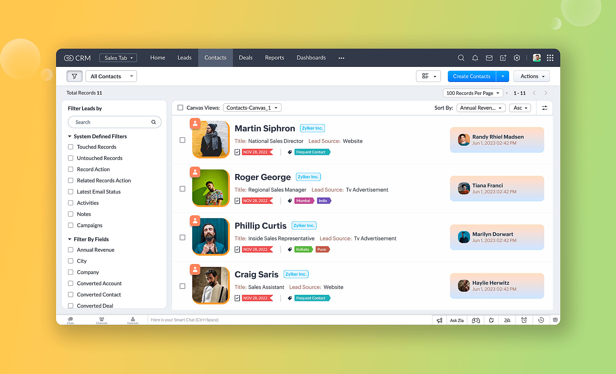
Example: Marketing teams might use the Canvas view to track campaign performance. They could display Campaign Name, Status, and Key Metrics (e.g., Click-Through Rate, Conversion Rate) with corresponding icons and colors. By incorporating charts showing performance trends and buttons for quick actions like "Send Follow-Up Email," the team can manage campaigns more effectively and respond to data insights promptly.
2. Tile View: A Visual Snapshot for Quick Reference
Ideal for: Data points are presented in an easy-to-digest format, ideal for situations where users need a quick visual summary of a many records.
Best Practices:
- Focus on Visual Appeal: The visual impact of each tile can be heightened by incorporating company logos, product images, or relevant icons.
- Limit Information Density: The most essential details should be included in each tile (e.g., name of contact, company logo, current stage of the project and so forth)
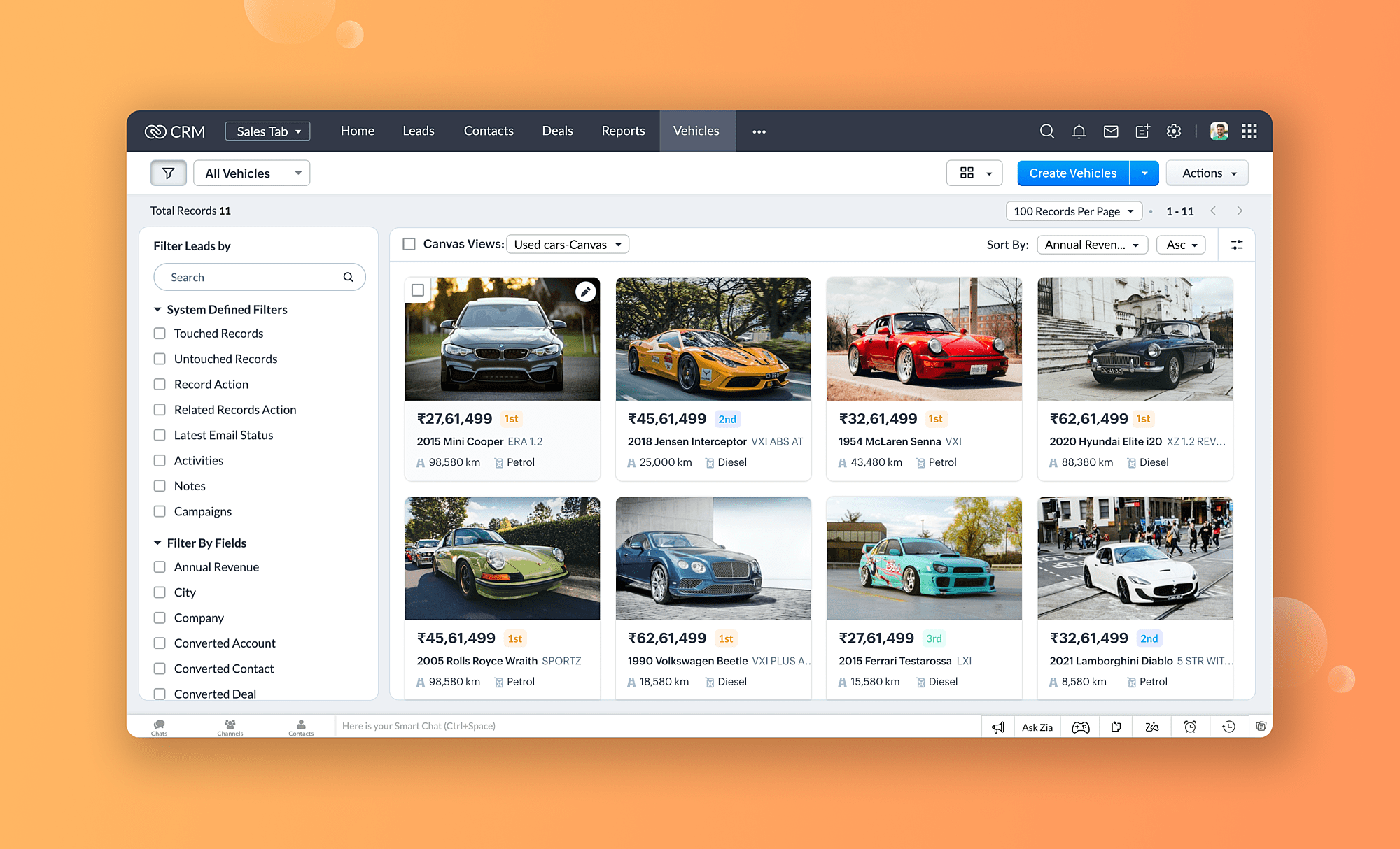
Example: It might be useful for a marketing team to visualize ongoing marketing campaigns using the tile view. In each tile, you can see the campaign name, an icon representing the target audience (demographic), and a key performance indicator (KPI) like the number of visitors to the website or the number of leads generated.
3. Table View: The Spreadsheet-like view for Data Analysis
Ideal for: Analyze and compare large amounts of data. With its spreadsheet-like layout and robust sifting, filtering, and grouping options, the table view is a great way to organize data.
Best Practices:
- Conditional Formatting: To highlight important data points, use conditional formatting (e.g., red to indicate things that are overdue, green to indicate things that have exceeded target value).
- Enable Grouping: For a more granular analysis, allow users to group records based on specific criteria (e.g., industry, product category).
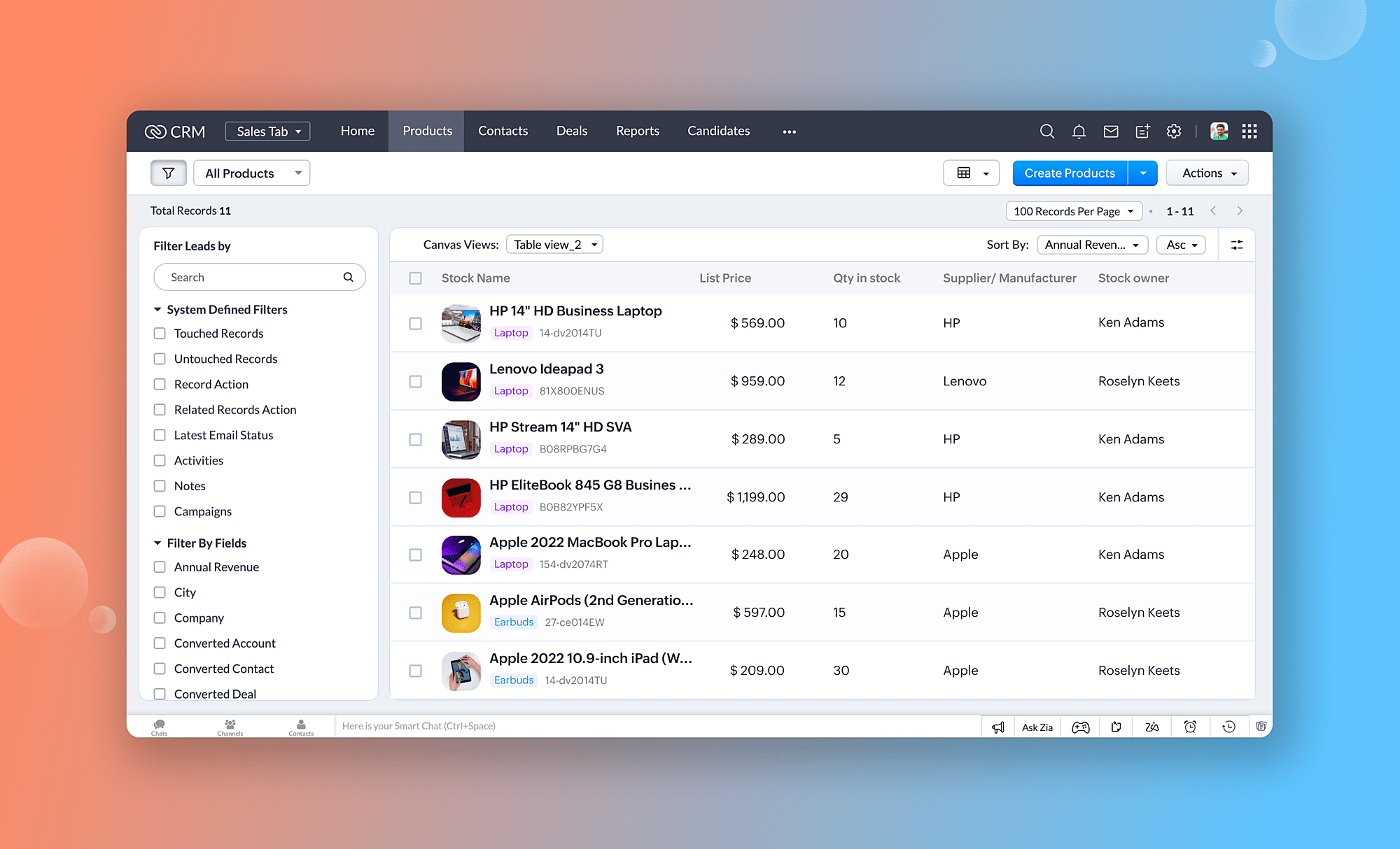
Example: A customer support team might utilize the table view to manage customer support tickets. Columns could include customer name, product, issue category, and ticket priority. Organizing by "Priority" allows them to address urgent issues first, while grouping by "Product" allows them to discover trends related to specific products.
b. Record Detail Page Customization:
- Grouping Related Information:
The record detail pages provide in-depth information about specific records (such as contacts or deals). To organize and retrieve information more efficiently, Canvas allows you to group related information using sections and dividers. Sections are groups of related records, while dividers are subgroups of sections. Dividers can be used to organize sections into subcategories further, making it easier to find relevant information quickly.
Example: On a contact detail page, group contact information (name, email, phone number) in one section, while grouping communication history (emails, calls) in another section. As a result, sales reps can quickly find the information they need due to a clear visual hierarchy.
- Highlighting Key Fields:
Certain fields within a record might be more critical than others. With Canvas, you can highlight these key fields with bold text, larger font sizes, and colored backgrounds. This makes the fields easier to spot and emphasizes the importance of the information they contain. Additionally, it makes it easier for users to quickly scan through the record to find the information they need.
Example: On a lead detail page, you might want to highlight the lead source (e.g., website form, referral) and the industry of the lead's company. This can help provide more context and provide valuable insight into the lead's potential. Additionally, highlighting this information can help inform your sales team to prioritize the lead and reach out to them sooner.
By understanding these view types and their strengths of each Canvas view type, you can able to create customized interfaces within Zoho CRM that empower your team to work more efficiently.
4. Prioritize Key Information
It is essential to ensure that the most crucial information is easily accessible when designing a CRM layout. Prioritize the data that needs to be easily accessible. Group similar items together and make them easy to find. Additionally, use color coding and labels to differentiate important information from less important items.
Key Steps:
- Identify Key Data Points: Based on user feedback, determine which data points are most significant. Analyze the data points to determine their relevance to the user's needs. Determine which data points are most important to the user and prioritize them accordingly.
- Arrange Information Hierarchically: Put the most important information at the top of the layout so that it is easily visible. The data should be logically organized using headings and sections.
- Use Visual Cues: Utilize icons, colors, and bold text to highlight critical information and make it stand out. This will help readers to quickly identify the most important information. Additionally, use contrasting colors to draw attention to important information. Finally, make sure that all critical information is easily accessible and visible.
- Create Custom Views: The view should filter and display only information relevant to the user's role based on the filtering criteria. As a result, end users can concentrate on the information they care most about instead of getting distracted by extraneous information.
Example:
For a sales manager, the top section might include an overview of sales targets, current performance, and upcoming meetings. Customer support agents might see open tickets, priority levels, and recent interactions with customers.
5. Place Widgets Strategically in the Canvas View
The widgets in Zoho CRM Canvas can be used to display specific information or perform certain actions. With widgets, you can visualize data, display information, enable interactivity, integrate with external systems, or build custom solutions for optimizing your CRM experience.
An examples of specific widgets that can be used in Zoho CRM Canvas are the Chart widget, which allows you to visualize data through various chart types, such as bar charts or pie charts, and the WebPage widget, which enables you to embed external web pages directly into your Canvas view.
Key Steps:
- Customize Widget Settings: Configure the widget settings to display the most relevant data. This could involve setting filters, choosing data sources, and defining display parameters-just to name a few.
- Interactive Widgets: Provide users with interactive widgets that allow them to update information or perform actions without leaving the Canvas to update it. A task completion widget, for instance, allows users to mark tasks as completed.
- Position Widgets Strategically: Widgets should be placed where they will be most useful for end users. Widget placement should be intuitive, making it easy for users to find the information they are looking for. Furthermore, widgets should be placed in a way that ensures users are not overwhelmed by information or have difficulty navigating through the interface.
6. Maintain a Clean and Uncluttered Layout
Zoho CRM Canvas offers robust customization capabilities that allow you to design clean and uncluttered layouts. Here’s how you can achieve this:
1. Prioritize Key Information
Essential Data First: Display the most important information that users need to access on a regular basis. You can hide less important details or make them accessible through secondary tabs or collapsible sections.
Hierarchy of Information: Guide users' attention to the most important elements first with headings, subheadings, and visual hierarchy. This makes the layout intuitive and easy to navigate.
2. Utilize white space effectively
Reduce clutter: Keep the layout simple and avoid overloading it with elements. Make use of white space to create a clean, organized look by separating different sections.
Breathing Room: Provide adequate spacing between widgets, text, and other elements. By doing this, users can focus on individual components without feeling overwhelmed.
3. Simplify Navigation
Clear Menus: You should use clear and concise labels for navigation menus and tabs. Users can find related items more easily when they are grouped.
4. Leverage Visual Widgets Wisely
Data Visualization: Use charts, graphs, and other visual widgets to present complex data in an easily digestible format. Visual representations convey information better than tables or text-heavy elements.
5. Implement collapsible sections
Collapsible Panels: Organize information that is not frequently accessed with collapsible panels. Users can expand these sections when needed, keeping the main layout uncluttered.
Accordion Style: Use an accordion-style layout for forms and detailed views. This allows users to focus on one section at a time without being distracted by other information.
6. Implement Conditional Formatting
Users can prioritize their actions more easily with conditional formatting, which highlights critical information. Differentiating data based on specific criteria can be accomplished by using colors, icons, and other visual cues.
- Use Color Coding: Use color coding to highlight different data states.
For example, use green to indicate completed tasks, yellow for tasks nearing their deadline, and red for overdue tasks. This visual cue helps users prioritize their actions. - Set Up Rules and Conditions: Define rules and conditions for when and how formatting should be applied. For instance, color a deal status field according to its value or highlight high-value deals by setting conditions.
- Test and Adjust: Once the conditional formatting has been implemented, ensure that it highlights the intended information effectively by testing it with users. You can improve the clarity and usability of the rules and colors based on the feedback you receive from users.
Here are some examples of conditional styling using Canvas Rules:
- Highlight Urgent Deals: Highlight the "Deal Stage" field in red if the stage is "Urgent."
- Emphasize Overdue Tasks: Highlight overdue tasks in bold red in the "Due Date" field.
- Identify High-Value Opportunities: For deals exceeding a certain threshold, increase the font size of the "Deal Value" field.
7. Leverage Custom Buttons and Links
With custom buttons and links, you can easily access frequently used actions and external resources from the Canvas interface. By incorporating these elements into your layout, you will save time and reduce the number of clicks required for routine tasks.
Identify Common Actions: You need to identify the actions that your users often perform and make custom buttons to execute these actions when they need to. For example, create a button for sending follow-up emails, generating quotes, or custom button that links to the company’s internal CRM guide can provide quick access to troubleshooting tips and best practices.
Create Direct Links: Provide links to external resources or related documents that users need to access frequently. This could include links to product catalogs, support documentation, or external databases.
Simplify Complex Processes: Automation of multi-step processes can be achieved by using custom buttons. For instance, a single button could trigger a sequence of actions, such as updating a record, sending an email, and logging an activity.
Final Thoughts
This blog post outlines best practices for effective customization,you're well on your way to mastering Zoho CRM Canvas customization. But the journey doesn't stop here. Canvas's real power lies in its ability to evolve alongside your business.As your business evolves, redesign your Canvas view to keep your design intuitive, and update it to adapt to your changing business requirements.
Maintaining a clean aesthetic in canvas customization is crucial as it enhances the user experience and makes the interface more visually appealing.
As you embark on this customization journey, remember that the key to success lies in balancing aesthetics with functionality, and always keeping the end-user in mind.
Feeling overwhelmed by the options for redesigning the Zoho CRM Interface in Canvas Builder?
No sweat! Our Zoho CRM Certified Canvas designers will handle redesigning your Zoho CRM Module and record details page to your liking using Canvas.
🚨Simply Click below any one option to instantly Share this Post😊
Get Early Access to our Exclusive Content Now!
📩 Receive our exclusive content, automation tips, special ofers, and insider tips only available to email subscribers. Don't Miss it!

